Title

Seeing Science Clearly

Subhead
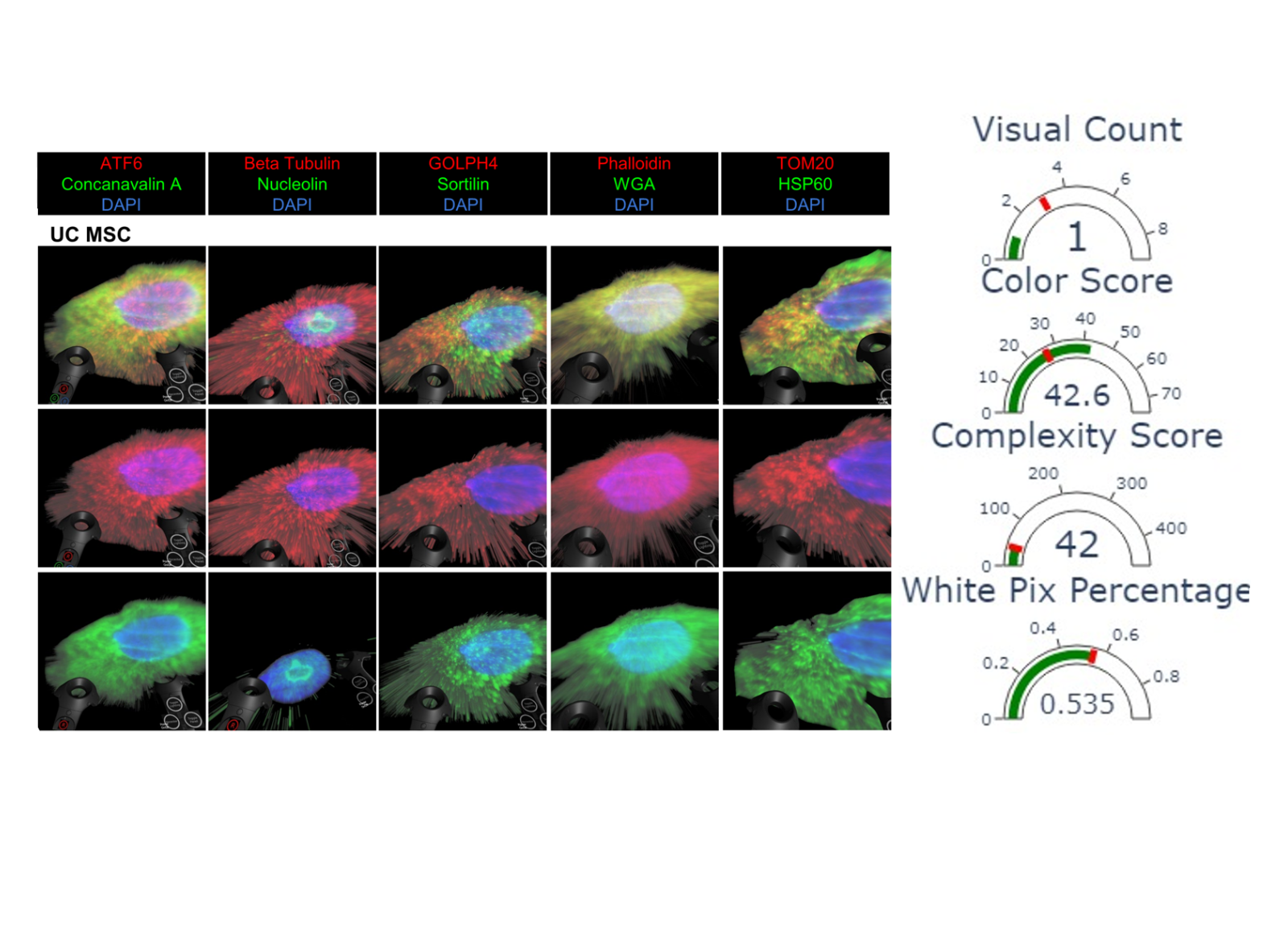
New tools from the Coskun Lab help evaluate biomedical data visualizations.
ID
Mar 11, 2026 | By Leeanna Allen
News Image
A grid of fluorescent microscopy images of UC MSC cells arranged in three rows and five columns. Each column corresponds to a different staining combination: ATF6 with Concanavalin A and DAPI; Beta Tubulin with Nucleolin and DAPI; GOLPH4 with Sortilin and DAPI; Phalloidin with WGA and DAPI; and TOM20 with HSP60 and DAPI. Each image shows a single cell with a brightly colored nucleus and surrounding cytoskeletal or organelle‑specific staining. Colors vary by marker set, including green, red, blue, and yellow
Image Caption
A new algorithm helps biomedical engineers determine the quality of scientific figures like this one.
Widgets

With little formal training or education, many biomedical engineers lack the skills to design and evaluate effective data visualizations. How can biomedical engineers know if a scientific figure is good or not?   When Ahmet Coskun, associate professor in the Wallace H. Coulter Department of Biomedical Engineering, and his team didn’t find the answers they needed in existing literature, they took matters into their own hands.  Coskun explains, “We read all these papers and look at these figures, but how do we really judge the quality of a figure? There was no clear, automated algorithm to do that—so we built one.” 

The team created an algorithm to help researchers evaluate scientific figures called Metrics for Evaluation and Discretization of Biomedical Visuals (MEDVIS), recently published in PLOS One.  

A repeat of the same UC MSC fluorescent microscopy grid shown in Image 1, with five columns of stain combinations and three rows of single‑cell images. To the right of the grid, three gauge‑style dials display numerical metrics: a color score of 42.6, a complexity score of 42, and a white pixel percentage of 0.535. Each gauge includes a semicircular scale with indicator needles.
MEDVIS evaluates figures on characteristics important to data visualization in biomedical engineering. The algorithm rates this visual as “good.”

MEDVIS quantitatively evaluates figures on four criteria: white space, number of visualizations, color density, and image complexity. The team selected these criteria based on their importance in data visualization, especially for the type of figures often used in biomedical engineering. The algorithm provides a score and lets researchers know if their visualizations are “good” or if there are areas for improvement.  

In validation studies, MEDVIS results aligned strongly with assessments from trained researchers.  

“Our quantification captures the same things that bother people, like too much white space, cluttered complexity, poor color choices, and it does so consistently,” Coskun said. 

Two panels of immunofluorescence results comparing indirect versus direct staining for HSP60. The indirect staining panel includes a grid of blue‑ and green‑fluorescing cell images and a bar graph displaying quantitative results. The direct staining panel shows a similar layout with blue and green fluorescent images and a corresponding bar graph. To the right of both panels, three gauge‑style dials show a visual count of 2, a color score of 53.9, a complexity score of 52, and a white pixel percentage of 0.6
MEDVIS evaluated this figure as "good" in all categories except white space usage, where it slightly exceeds the recommended threshold. (Created with BioRender.com)

Besides looking at criteria for “good” visualizations, the team also compared 26 commonly used data visualization tools. Criteria included ease of use, customizability, cost, and required background knowledge — for example, how much coding knowledge users need to create visualizations in the platform.  

Their analysis found that the best tool will depend on the user’s audience, technical background, data, and budget. The paper’s authors recommended biomedical engineers consider all these factors when designing data visualizations.  

The researchers have shared MEDVIS on GitHub for others to use. Students in Coskun’s Biomedical Data Visualization course are also using the program.  

The team hopes to use deep learning to train MEDVIS to evaluate more advanced criteria and integrate the tool into existing artificial intelligence platforms. The team is also working on a web-based version to make the tool widely available.  

Citation

Torres H, Ozturk E, Fang Z, Zhang N, Cai S, Sarkar N, et al. (2025) What is a “Good” figure: Scoring of biomedical data visualization. PLoS One 20(11): e0336917. https://doi.org/10.1371/journal.pone.0336917  

About the Research

Research reported in this study was supported by the National Institute of General Medical Sciences of the National Institutes of Health, award No. T32GM142616. Any opinions, findings, and conclusions or recommendations expressed in this material are those of the authors and do not necessarily reflect the views of any funding agency. 

Media Contact

Contact the BME Communications team to connect with a faculty member or student about academics or research happening in the Wallace H. Coulter Department of Biomedical Engineering.